SOng Lyrics
Project Summary
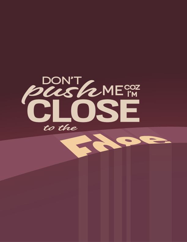
This project was a challenge in finding an appropriate text solution to creatively fit a song lyric of my choice. Out of the hazy dark background emerges the words of the lyrics. The warm yellow helps portray a sense of warning to the viewers. The word ‘edge’ serves as the focal point of this piece. It’s golden surface slides of the edge to complete the visual narrative. During this project, I learned the process of font selection as well as the creation of visual hierarchy.
Project Summary
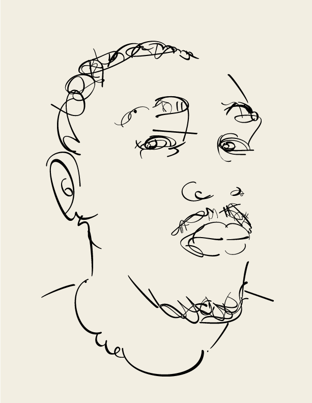
This art piece is a self portrait using a font of my choice. The first challenge was picking the specific font in an ocean of options. All the lines and shadows were created using only letters and some characters from Carbfred pro in Adobe illustrator. This font uses a handwritten style lettering and old school calligraphy. This was the reason I was attracted to it. It’s unique curvature and weight variation gives an illusion of shadows and this gives it a sense of depth. During this project, I enhanced my precision drawing skills with the software, as well as my ability to manipulate type in solving visual problems.
Project Summary
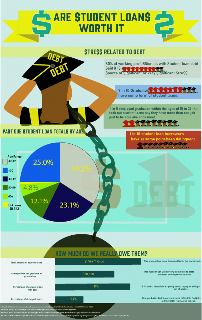
This infographic is a pictorial representation of the struggles some young graduates face. I conducted primary and secondary research in coming up with my hypothesis. I used a pictogram and a pie chart to show these hard facts. I diligently chose which information to show. Some challenges in making this poster were the choice of color scheme, general layout and type to reach my intended audience. The focal point of this poster is a graduate in a gown presumably reacting to the hole that they have dug for themselves over the last few years. I used Adobe illustrator and Adobe InDesign to make this piece.